3 Charts That Explain What’s Really Moving Markets Right Now
Discover the key forces driving global markets this week through three powerful charts. From U.S. equity trends to sector rotation and investor sentiment, this analysis breaks down what’s really moving stocks, commodities, and indices worldwide. Learn how market breadth is shaping the S&P 500, which sectors are leading gains across Wall Street and Asia, and how volatility and sentiment indicators signal the next trend. Perfect for traders, investors, and analysts tracking daily market momentum across the U.S., Europe, and emerging economies.
Markets aren’t a mysterious mafia — they’re a messy relationship between investors, sectors, and fear levels. These three charts tell the story faster than your uncle forwarding a “hot stock” meme.
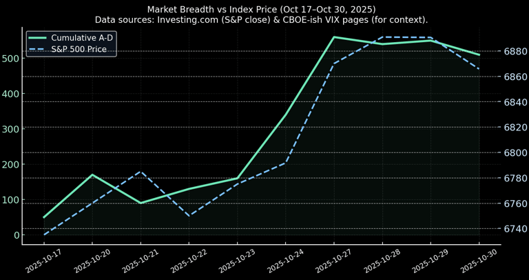
1) Market Breadth — Are Most Stocks dating the rally or sitting single?
Why it matters (aka the breakup test): Price indexes (S&P/₹Sensex/etc.) can rise while most stocks don’t. That’s like a party photo where the caption says “everyone’s vibing” but actually only three people are dancing. Breadth shows if the market’s strength is broad-based or just a couple of stars dragging the show.
What to look for: Advancing vs Declining issues, or a cumulative advance-decline line. Rising index + falling breadth = warning. Rising breadth = healthy rally.
If that line is going up with the index — great. If your index is shooting up but the AD line is flat or down, the party has selective lighting: most stocks aren’t invited.
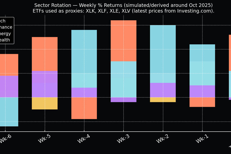
2) Sector Rotation — Which sector is ghosting the rally (and which is sliding into DMs)?
Why it matters: Money rotates. One month it’s tech on top, next month it's energy. This chart shows where institutional flows are actually going. Think of it like who’s trending on your Feed — the most-liked sectors usually carry the market.
What to look for: Relative Strength Index across sectors or percentage weight change. Use a stacked bar or multi-line to compare relative performance.
If tech keeps hogging gains while other sectors are flat, the index is concentrated — risky if that one sector coughs. If rotation shows broad-based gains, the rally is more sustainable.
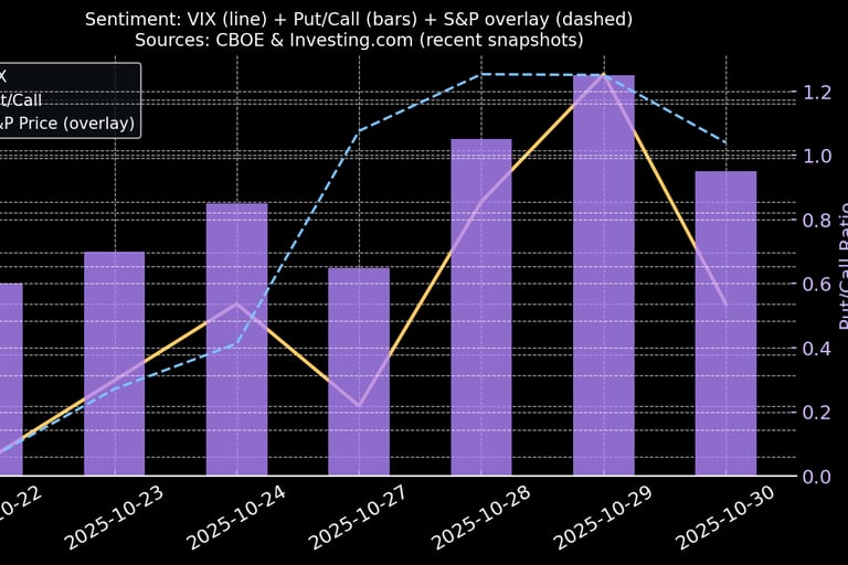
3) Fear vs Greed (VIX / Put-Call / Funding) — Are traders ghosting or sliding into DMs?
Why it matters: Sentiment indicators show the emotional backbone of the market. Are traders buying on dips or panic-selling? This chart can be as simple as VIX vs index, or a combo of VIX and put/call ratio.
What to look for: Rising VIX = fear. Low put/call = complacency. Divergence between falling prices + falling VIX is weird (bad).
If VIX spikes and put/call also rises = fear. If VIX falls and put/call is low = complacency (warning). Watch divergence: rising index + rising VIX = rotation into safety, but check breadth.
Putting it all together — how to read the trio like a pro (without the ego)
Breadth rising + sector rotation broad = healthy, go-time (with sizing discipline).
Breadth flat/declining + one sector carrying = fragile; treat pullbacks like relationship red flags.
Rising VIX + rising put/call = panic. Either opportunity or trap — size small and pick winners.
Complacency (low VIX, low put/call) + concentrated breadth = classic bubble-ish behaviour. Move cautiously.